1st Place: NC3C 2020 – Branding/Logo Design
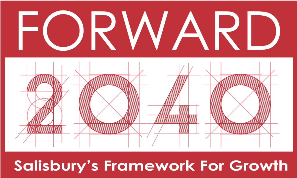
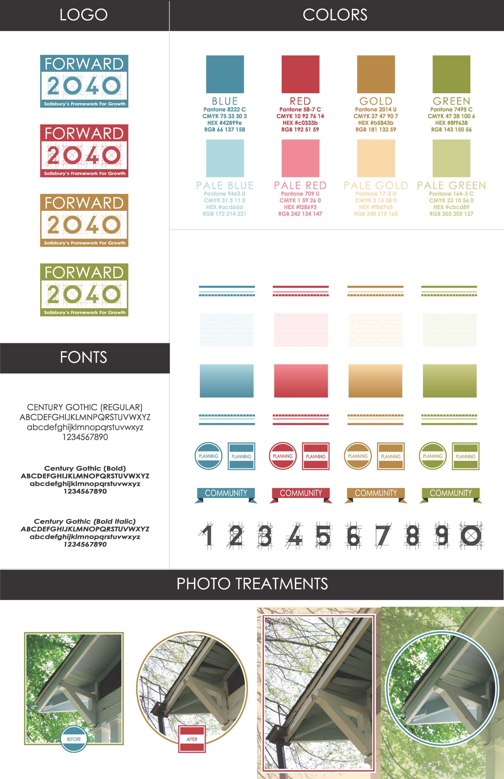
Forward 2040
Brief:
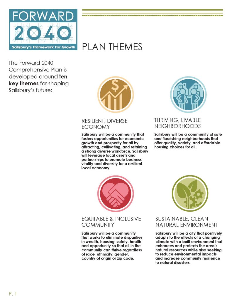
One of the biggest obstacles for the Salisbury planning department is convincing people to spend their free time taking surveys, participating in events and providing feedback. When the time came to revise the City’s 20-year comprehensive plan, from 2020 to 2040, it was critical to generate interest and excitement. The new plan needed a catchy name and branding that could last for two decades.
Solution:
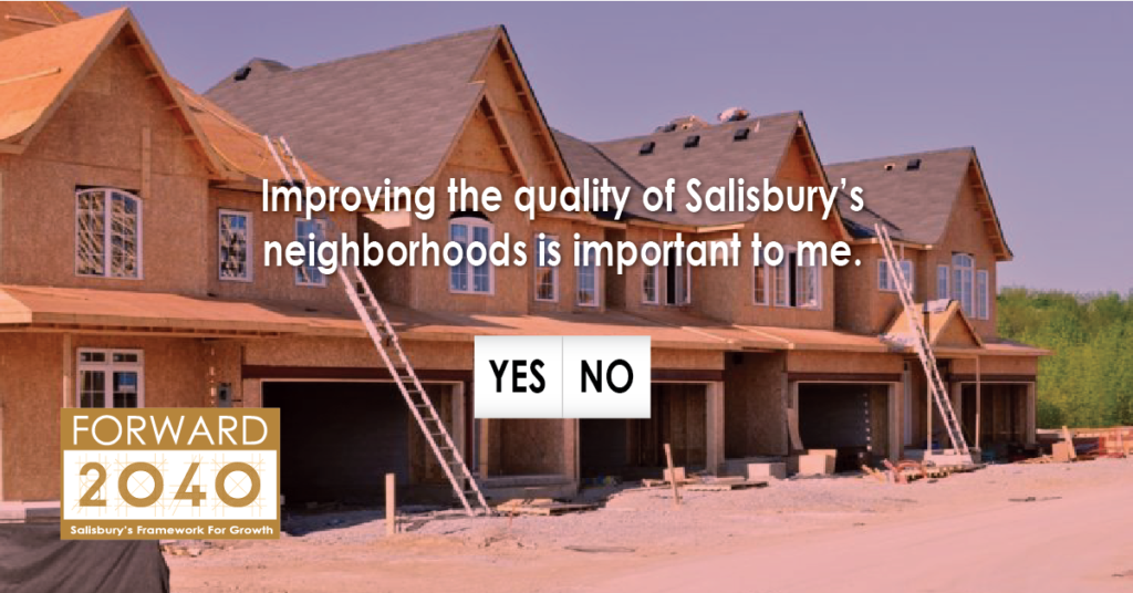
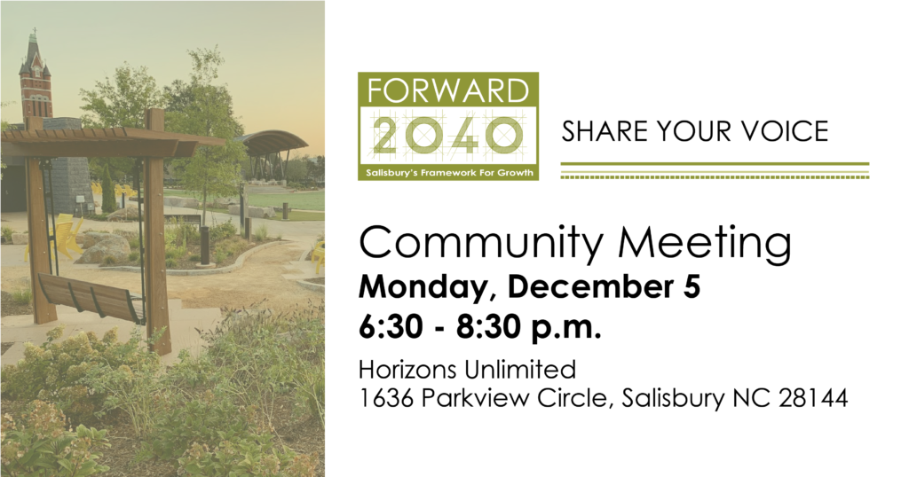
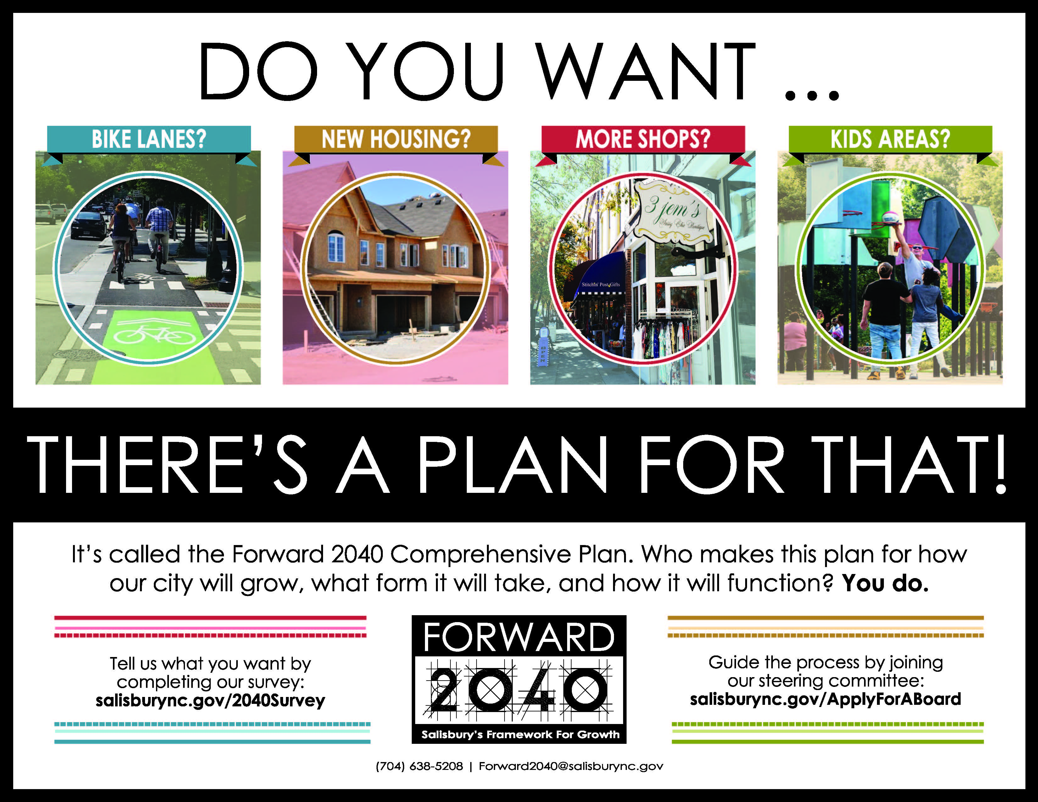
Brainstormed new plan name “Forward 2040.” Designed logo to encourage residents to engage with the planning process. The logo shape is “stamp- like” and integrates an elaborate, architect’s font in reference to the planning department. Developed a branding guide for use across multiple media channels. The new branding mixed bright colors and optimistic photography to create a feeling of a positive future.
Sustainable Salisbury
Brief:
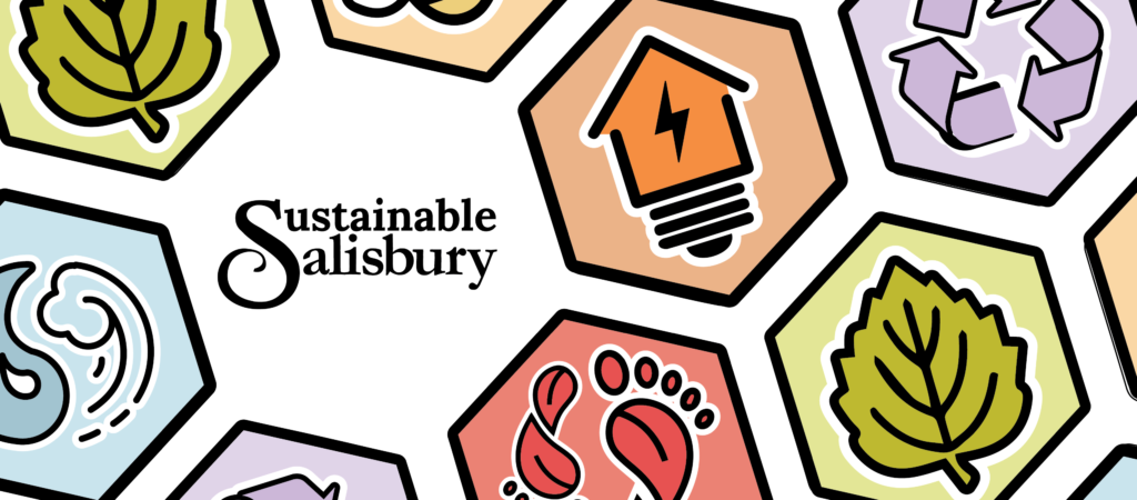
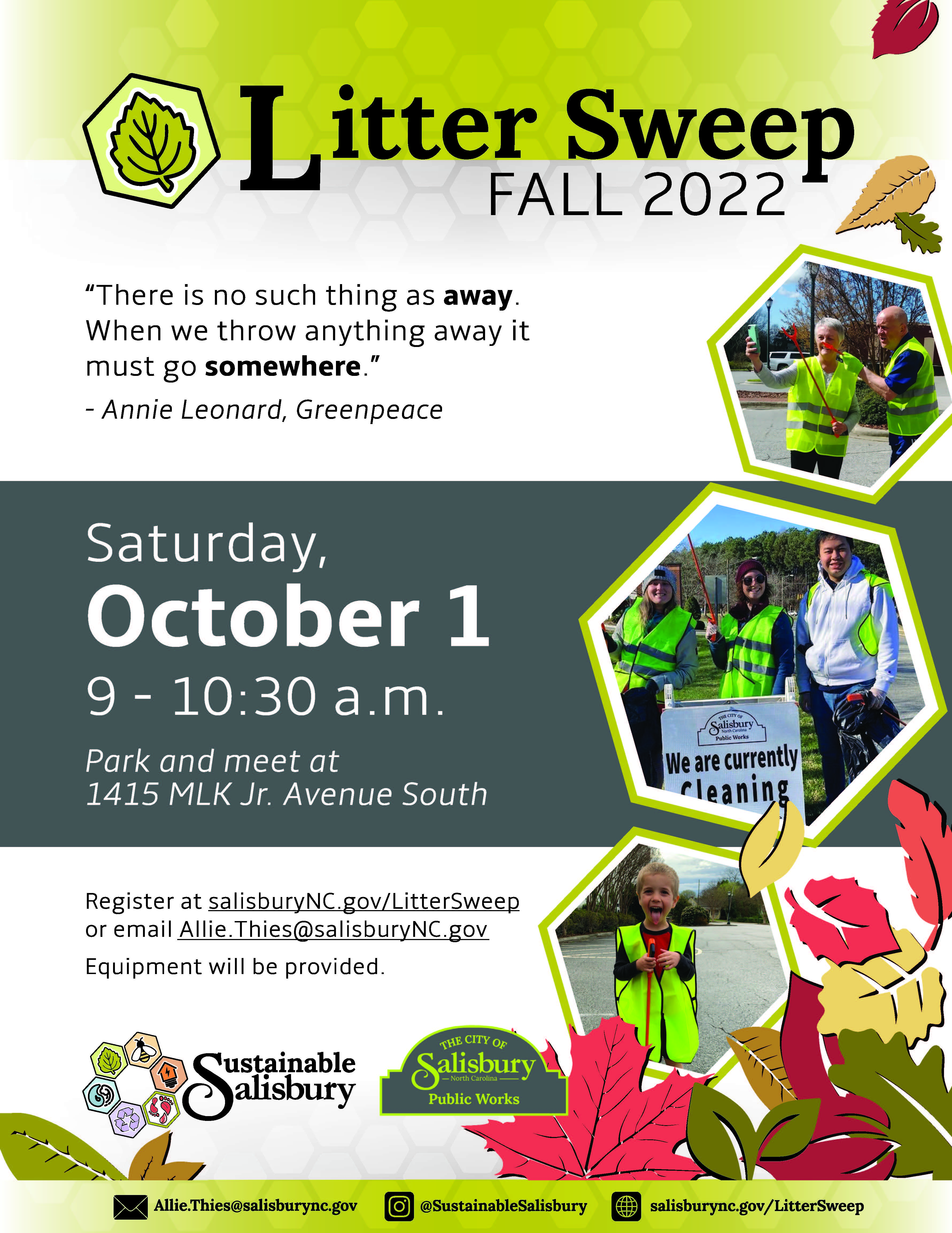
A new cross-department program focused on sustainability kicked off in Salisbury. This program would need an identity that would help visualize goals and set the stage for years to come. The steering committee identified six focus areas: energy-saving, intergenerational equity, reduce-reuse-recycle, water conservation, environmental conservation and wildlife conservation.
Solution:
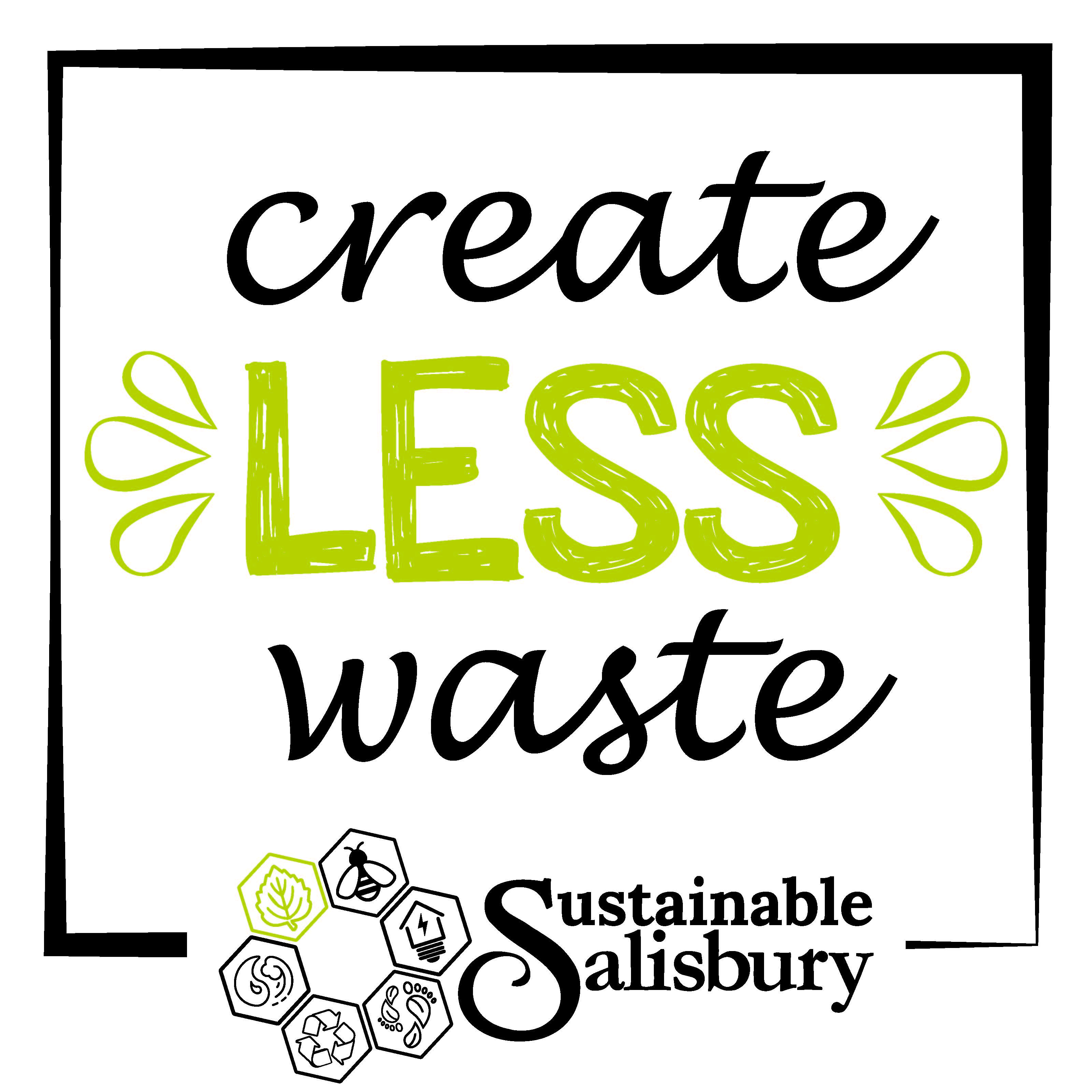
Led focus groups, resulting in optimistic tone and clean, minimal style. Designed a logo with a range of bright colors and simplified icons to capture the wide range of focus areas that fall under the umbrella of sustainability. Developed a brand strategy where each icon and color combination would be used to identify the associated category of future initiatives.

Bell Tower Brewfest
Brief:
The local Bell Tower Green is a popular park which becomes even more popular when the beer festival begins! This new beer festival needed strong branding to establish itself in a crowded market and to separate this vibrant event from previous, similar events held by the same organization.
Solution:
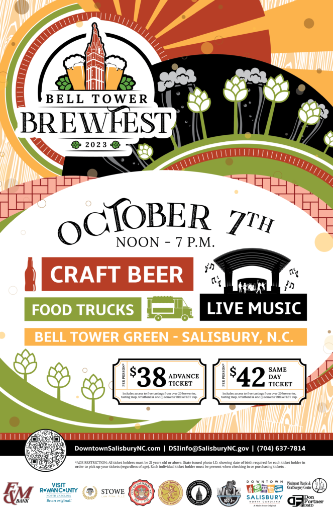
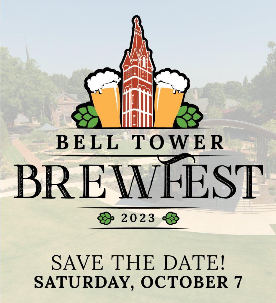
Designed a logo that captured the theme of beer, hops and the iconic bell tower for which the Bell Tower Green is named. Developed a strong, graphic brand which conveys the sense of exuberant festivities, with clean lines and allusions to beer, hops and the park setting.
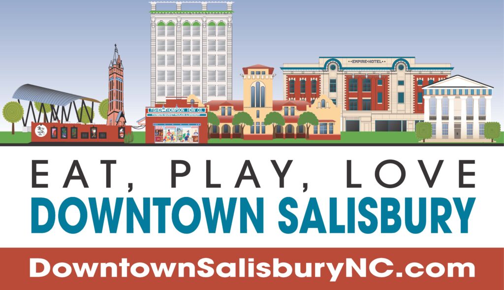
Downtown Salisbury
Brief:
The Downtown Salisbury, Inc. (DSI) nonprofit had a pre-existing logo but no brand guidelines or sense of identity. Projects for DSI cover all media channels and a wide range. The branding needed to be flexible to these many projects but a consistent internal design to tie them back to the overall organization.
Solution:
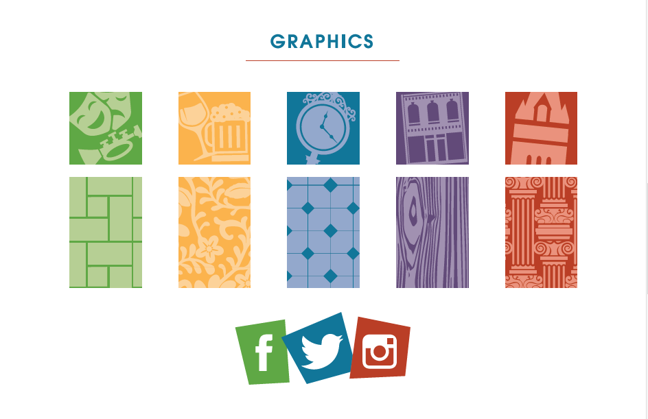
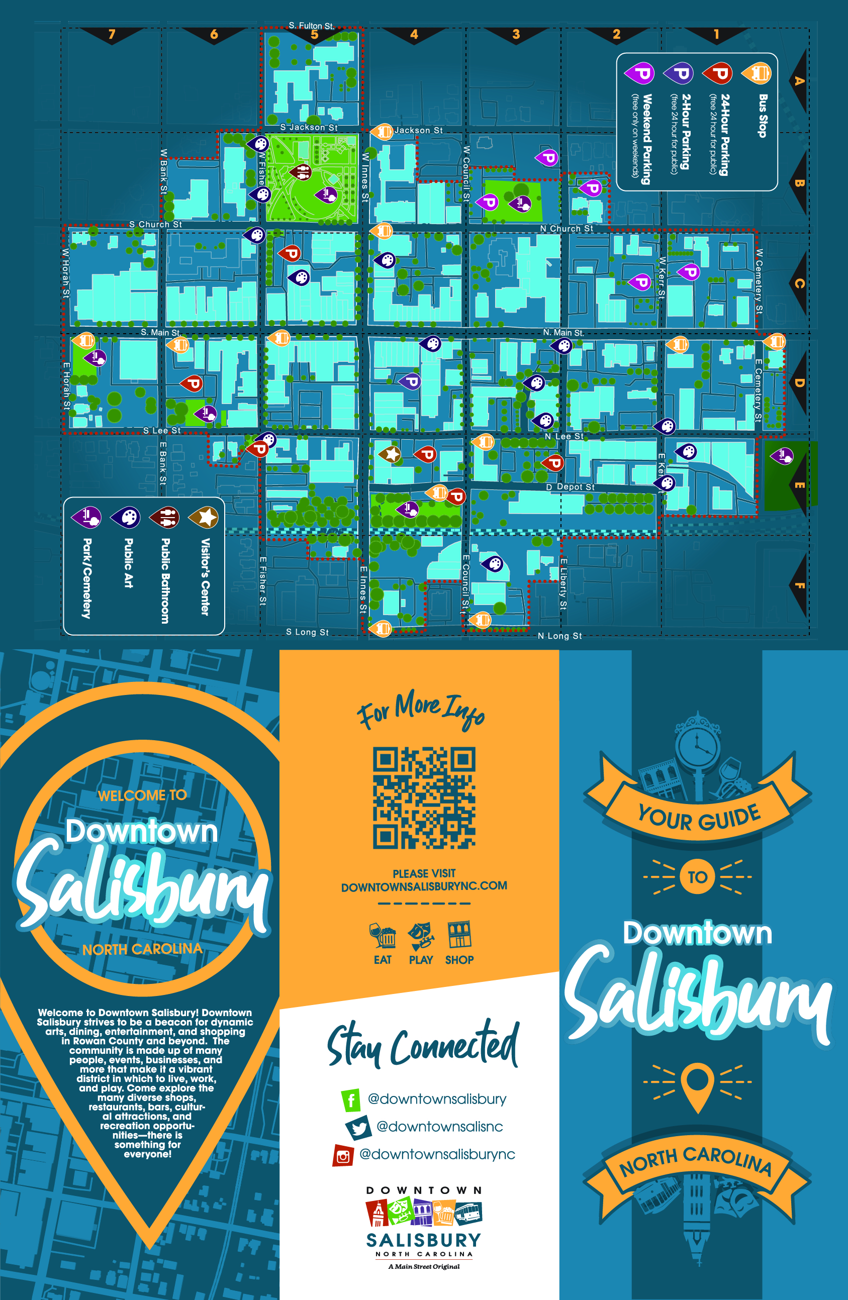
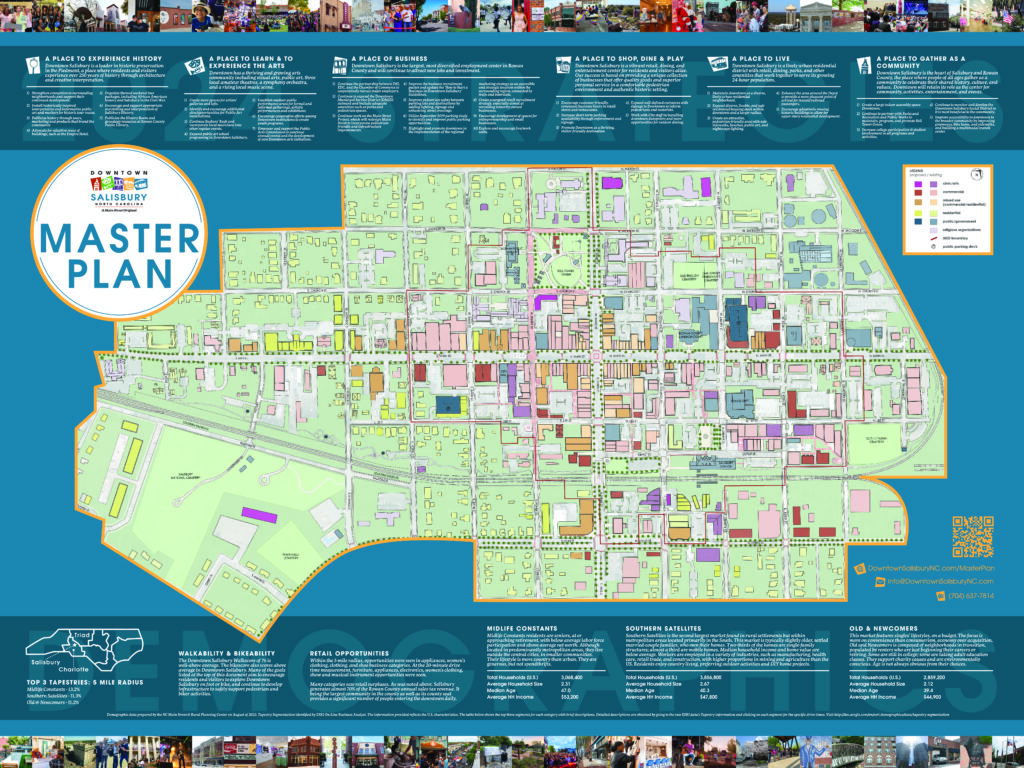
Developed branding guidelines with colors, fonts and elements that connect to the original logo. Designed for events, billboards, decals and more to build the brand identity across multiple media channels that is more than just a logo.
